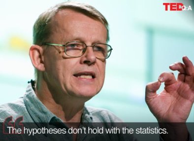
The Swedish medical researcher has a way with numbers. He brings heavy and dreary statistics into life using a combination of animated graphics and equally animated presentations. With the drama and urgency of a sportscaster, he uses a new presentation tool called Gapminder to debunk various myths about world – economic development, disparities and how well (or poorly) we share our planet’s resources.
Hans Rosling is Professor of International Health at Karolinska Institutet (which awards the Nobel Prize in medicine), but it’s his other role – as Director of the Gapminder Foundation – that he plays ‘statistics guru’ to the whole world. If you’re perplexed by lots of numbers, he’s the man who can make sense of it all.
In some ways, Rosling and Gapminder present in live action – and on video – what the Atlas of the Real World attempted to do in 2D maps: show the world as it is, with little or no distortion or misconceptions. That effort, published in late 2008, uses software to depict the nations of the world, not by their physical size, but by their demographic importance on a range of subjects.
I’ve watched a number of Rosling talks on video online. He makes no attempt to conceal his Scandinavian accent, and his English grammar is not always perfect. But it doesn’t matter: the guy has such mastery over his ideas and statistics, and a great stage presence too. He’s profound and funny at the same time, without being condescending that most experts and especially professors are.
Here’s an example of Rosling at his best: recorded in February 2006 in Monterrey, California:
No more boring data: TEDTalks
Rosling’s quest to use numbers to shatter stereotypes of rich and poor countries has brought him global prominence. He was one of the world’s “100 most important global thinkers” of 2009, according to Foreign Policy Magazine.
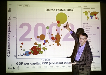
Foreign Policy noted: “Rosling is well known for his energetic lectures, in which he narrates mind-blowing statistics on development and public health — as they literally move across a screen. Imagine x-y axes filled with data points, each representing a country. As time passes, the dots move, realigning to show changes in child mortality, percentage of paved roads, unemployment rates, or pretty much any other metric you can imagine.”
Here are some more examples of Rosling magic:
200 years that changed the world (with Hans Rosling)
For the first time, Gapminder can now visualize change in life expectancy and income per person over the last two centuries. In this Gapminder video, Hans Rosling shows you how all the countries of the world have developed since 1809 – 200 years ago.
Hans Rosling on HIV: New facts and stunning data visuals
Hans Rosling unveils new data visuals that untangle the complex risk factors of one of the world’s deadliest (and most misunderstood) diseases: HIV. He argues that preventing transmissions — not drug treatments — is the key to ending the epidemic.
Hans Rosling: Asia’s rise — how and when
This is one of the funniest Rosling talks I’ve watched online so far. Speaking at TEDIndia in November 2009, Rosling recalled how he was a young guest student in India when he first realized that Asia had all the capacities to reclaim its place as the world’s dominant economic force. He graphs global economic growth since 1858 and predicts the exact date that India and China will outstrip the US.
Note:
Rosling and Gapminder developed the Trendalyzer software that converts international statistics into moving, interactive and enjoyable graphics. The aim is to promote a fact-based world view through increased use and understanding of freely accessible public statistics. His lectures using Gapminder graphics to visualise world development have won awards by being humorous yet deadly serious. The interactive animations are freely available from the Foundation’s website. In March 2007 Google acquired the Trendalyzer software with the intention to scale it up and make it freely available for public statistics. Google has since made available as Motion Chart, a Google Gadget.
