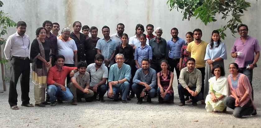
Sri Lankan Media Fellows on Poverty and Development with their mentors and CEPA coordinators at orientation workshop in Colombo, 24 Sep 2016
“For me as an editor, there is a compelling case for engaging with poverty. Increasing education and literacy is related to increasing the size of my readership. Our main audiences are indeed drawn from the middle classes, business and policymakers. But these groups cannot live in isolation. The welfare of the many is in the interests of the people who read the Daily Star.”
So says Mahfuz Anam, Editor and Publisher of The Daily Star newspaper in Bangladesh. I quoted him in my presentation to the orientation workshop for Media Fellows on Poverty and Development, held in Colombo on 24 September 2016.
Alas, many media gatekeepers in Sri Lanka and across South Asia don’t share Anam’s broad view. I can still remember talking to a Singaporean manager of one of Sri Lanka’s first private TV stations in the late 1990s. He was interested in international development related TV content, he told me, “but not depressing and miserable stuff about poverty – our viewers don’t want that!”
Most media, in Sri Lanka and elsewhere, have narrowly defined poverty negatively. Those media that occasionally allows some coverage of poverty mostly skim a few selected issues, doing fleeting reporting on obvious topics like street children, beggars or poverty reduction assistance from the government. The complexity of poverty and under-development is hardly investigated or captured in the media.
Even when an exceptional journalist ventures into exploring these issues in some depth and detail, their media products also often inadvertently contain society’s widespread stereotyping on poverty and inequality. For example:
Black and white images are used when colour is easily available (as if the poor live in B&W).
Focus is mostly or entirely on the rural poor (never mind many poor people now live in cities and towns).
The Centre for Poverty Analysis (CEPA), a non-profit think tank has launched the Media Fellowship Programme on Poverty and Development to inspire and support better media coverage of these issues. The programme is co-funded by UNESCO and CEPA.
Under this, 20 competitively selected journalists – drawn from print, broadcast and web media outlets in Sinhala, Tamil and English languages – are to be given a better understanding of the many dimensions of poverty.
These Media Fellows will have the opportunity to research and produce a story of their choice in depth and detail, but on the understanding that their media outlet will carry their story. Along the way, they will benefit from face-to-face interactions with senior journalists and development researchers, and also receive a grant to cover their field visit costs.
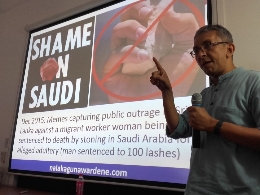
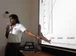
Nalaka Gunawardene speaks at orientation workshop for Media Fellows on Poverty and Development at CEPA, 24 Sep 2016
I am part of the five member expert panel guiding these Media Fellows. Others on the panel are senior journalist and political commentator Kusal Perera; Chief Editor of Daily Express newspaper Hana Ibrahim; Chief Editor of Echelon biz magazine Shamindra Kulamannage; and Consultant Editor of Sudar Oli newspaper, Arun Arokianathan.
At the orientation workshop, Shamindra Kulamannage and I both made presentations on media coverage of poverty. Mine was a broad-sweep exploration of the topic, with many examples and insights from having been in media and development spheres for over 25 years.
Here is my PPT:
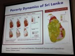
More photos from the orientation workshop:
Nalaka Gunawardene speaks at orientation workshop for Media Fellows on Poverty and Development at CEPA, 24 Sep 2016
Workshop for Media Fellows on Poverty & Development, Colombo, 24 Sep 2016
Workshop for Media Fellows on Poverty & Development, Colombo, 24 Sep 2016
Workshop for Media Fellows on Poverty & Development, Colombo, 24 Sep 2016
Workshop for Media Fellows on Poverty & Development, Colombo, 24 Sep 2016
Shamindra Kulamannage at Workshop for Media Fellows on Poverty & Development, Colombo, 24 Sep 2016
Workshop for Media Fellows on Poverty & Development, Colombo, 24 Sep 2016
Workshop for Media Fellows on Poverty & Development, Colombo, 24 Sep 2016
Krishan Siriwardhana opens Workshop for Media Fellows on Poverty & Development, Colombo, 24 Sep 2016
In my Ravaya column (in Sinhala) this week, I write about Lentil As Anything, the uncommon restaurant chain in Melbourne, Australia. It has no prices on the menu, no cashier, no cash register. Customers are invited to dine first — and pay what they think their meal was worth. This pay-as-you-feel approach has survived a dozen years, earning its founder Shanaka Fernando honours and accolades.
In our age of technology, hundreds of millions of people — most of them poor, and women — are still toiling away in tasks where simple machines or devices could reduce their daily drudgery. Few inventors have bothered with these — probably because the beneficiaries are on the margins of society. Their needs are not a priority for most research institutes or high tech laboratories.
This is the theme of my Ravaya column (in Sinhala) published on 8 Jan 2012, reproduced in full below.It was inspired by, and mostly based on the inaugural Ray Wijewardene memorial lecture delivered by Dr Anil Kumar Gupta, India’s top innovation-spotter, in Colombo on 13 December 2011. He spoke on “Grassroots Innovation for Inclusive Development: From Rhetoric to Reality”
World map of human poverty...shows Asia harbouring over half
Take a close look at this map. What’s happened to our familiar world?
This is the map of human poverty — showing the proportion of poor people living in each country.
The size of each country/territory shows the overall level of poverty, quantified as the population of the territory multiplied by the Human Poverty Index. The index is used by the UNDP to measure the level of poverty in different territories. It attempts to capture all elements of poverty, such as life expectancy and adult literacy.
This map is from the recently released new book, Atlas of the Real World. It uses software to depict the nations of the world, not by their physical size, but by their demographic importance on a range of subjects.
It carries maps constructed to represent data, such as population, migration and economics. But instead of a conventional map being coloured in different shades, for instance, the maps in this Atlas are differently sized. For instance, a country with twice as many people as another is shown twice the size; a country three times as rich as another is three times the size. And so on.
When depicted in this manner, a very different view of our real world emerges. The one on the distribution of poverty, shown above, reminds us something often overlooked: there are more poor people in Asia than anywhere else in the world.
It takes a map like this to drive home such a basic fact. In most discussions on international development or poverty reduction, it is Africa that dominates the agenda. Even those organisations and activists who claim to be evidence-based don’t always realise that when it comes to absolute numbers, and not just percentages, poverty and under-development affects far more Asians than Africans.
Atlas of the Real World, which I haven’t yet seen except through glimpses offered by The Telegraph (UK) and BBC Online, offers many such insights on what our topsy-turvey world is really like.
Percentage population living on less than 1 dollar day 2007-2008 (Source: UN)
There are many ways of measuring income poverty, and experts don’t always agree on methods and outcome. But we will leave those technicalities to them. Global Issues is a good website that discusses these issues without too much jargon.
Accurately drawing a two-dimensional map of our spherical world has been a challenge for centuries. Today’s most widely used Mercator projection represents our usual view of the world – with north at the top and Europe at the centre. People in other parts of the world may not always agree with this view.
The Peters Projection World Map is one of the most stimulating, and controversial, images of the world. Introduced in the early 1970s, it was an attempt to correct many imbalances and distortions in the Mercator map.
An example: in the traditional Mercator map, Greenland and China look to be the same size but in reality, China is almost 4 times larger! Peters map shows the two countries in their relative sizes.
Atlas of the Real World also carries one map where the size of each territory represents exactly its land area in proportion to that of the others, giving a strikingly different perspective from the Mercator projection most commonly used. It is very similar to the Peters map of the world.
Our world depicted by each country's land area
The UNDP has been producing its influential Human Development Report since 1990. As far as I can discern, the HDR always uses conventional (Mercator?) maps, depicting data using the standard colour-coding or gray tones. The one I have reproduced in this post is an example.
Indeed, the UN’s Cartographic Section seems to favour these.
When would the UNDP – and other members of the UN family – start using more innovative ways such as those used in Atlas of the Real World? How much more effective can the UN’s analysis be if they move out of the comfort zone of Mercator?


 This map is from the recently released new book,

